Petcha
An innovative pet care information app that mitigates the research phase for new pet owners
Two other UX designers and I worked collaboratively on this project. My main responsibilities lied in ideation, wireframing, testing and prototyping.
2.5 Weeks ( March 2021 ) | Conceptual
The Problem
As pet ownership was on the rise, many new pet owners were underprepared to understand and meet their pets’ needs. Our goal was to bridge the gap between what they know and should know.
What do new pet owners look for, exactly?
We interviewed four people who have had their pets for less than one year to identify behaviors and pain points during their first few phases of pet ownership.
They were frustrated with reliability of multiple sources of information
They went through trial-and-error to find the right choice of pet foods and feeding portion
They were concerned about their pets' separation anxiety if they return to office or travel
They struggled with adjusting their lifestyle because they didn't expect how their pets' routine would impact their lives
The culmination of user research led to the development of our persona.
Goals
Ensure a smooth transition for his pet to settle into a new home
Learn about his puppy’s wants and needs while limiting trial and error
Find a balance between being a pet owner and his previous lifestyle
Pain Points
Getting conflicting advice from internet, family, friends, and professionals
Not sure when he should change any aspect of his pet’s care based on his age
Difficult to choose the right pet food his puppy likes while still offering high-value nutrition
Dino The Dog Dude

“A lot of research required to figure out one right answer”
Competitive Landscape
Three pet industry leaders provide pet care advice while leveraging their ecommerce, but the contents are text-heavy, unorganizable, hard to find and too general.
We selected YouTube as our comparator because it was our users' primary source of information. YouTube offers significant amount of contents for all kinds of research, but meanwhile, it can be difficult for people to filter out unreliable and irrelevant information.
Our opportunities:
Credible information in a concise and scannable format.
Personalized content unique to specific pets’ needs

We learned to let go of ideas.
We sketched out features such as tip of the day, meal and health reminder, FAQs and feeding calculator. However, we soon realized that we were trying to solve too many issues and we deviated from our core user needs: They wanted information pertaining to their own pets quickly and easily.
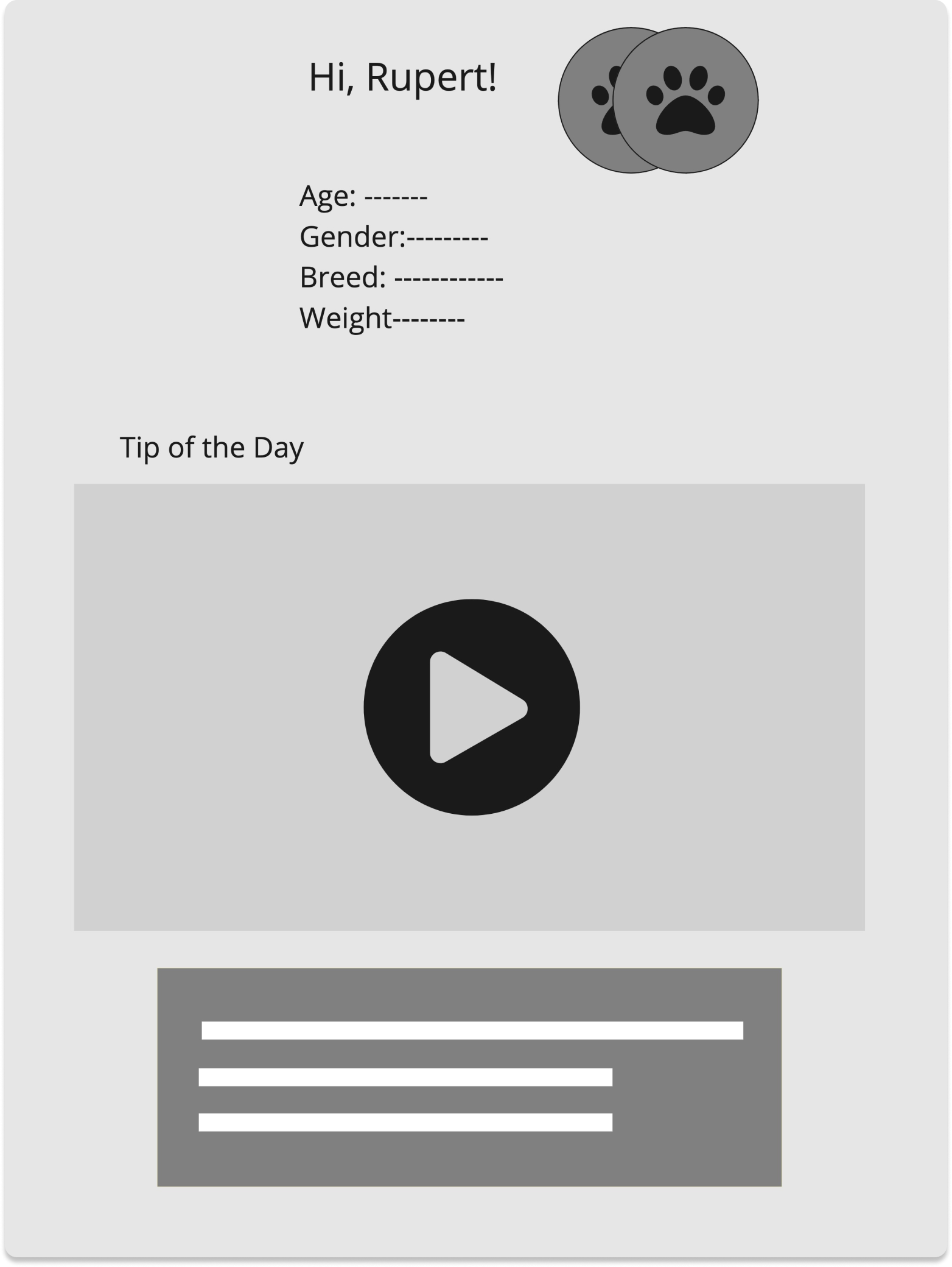
Tip Of The Day

Meal And Heath Reminder
FAQs
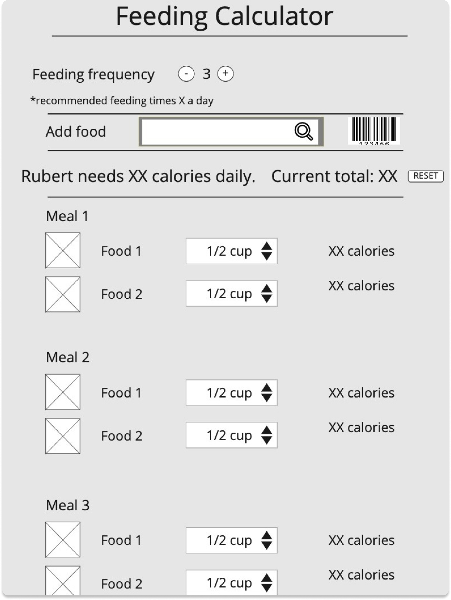
Feeding Calculator
Refocus.
Our designs pivoted from daily usage to as needed. We refocused on easing the worrisome first-time pet owning experience by providing personalized and reliable information in a delightful and streamlined way.
-
![]()
Pet Profile
Tailor content to the age and breed of users’ pets
-
![]()
Milestones
Show relevant information during each milestone period
Categorize by key areas of concern uncovered from user research
-
![]()
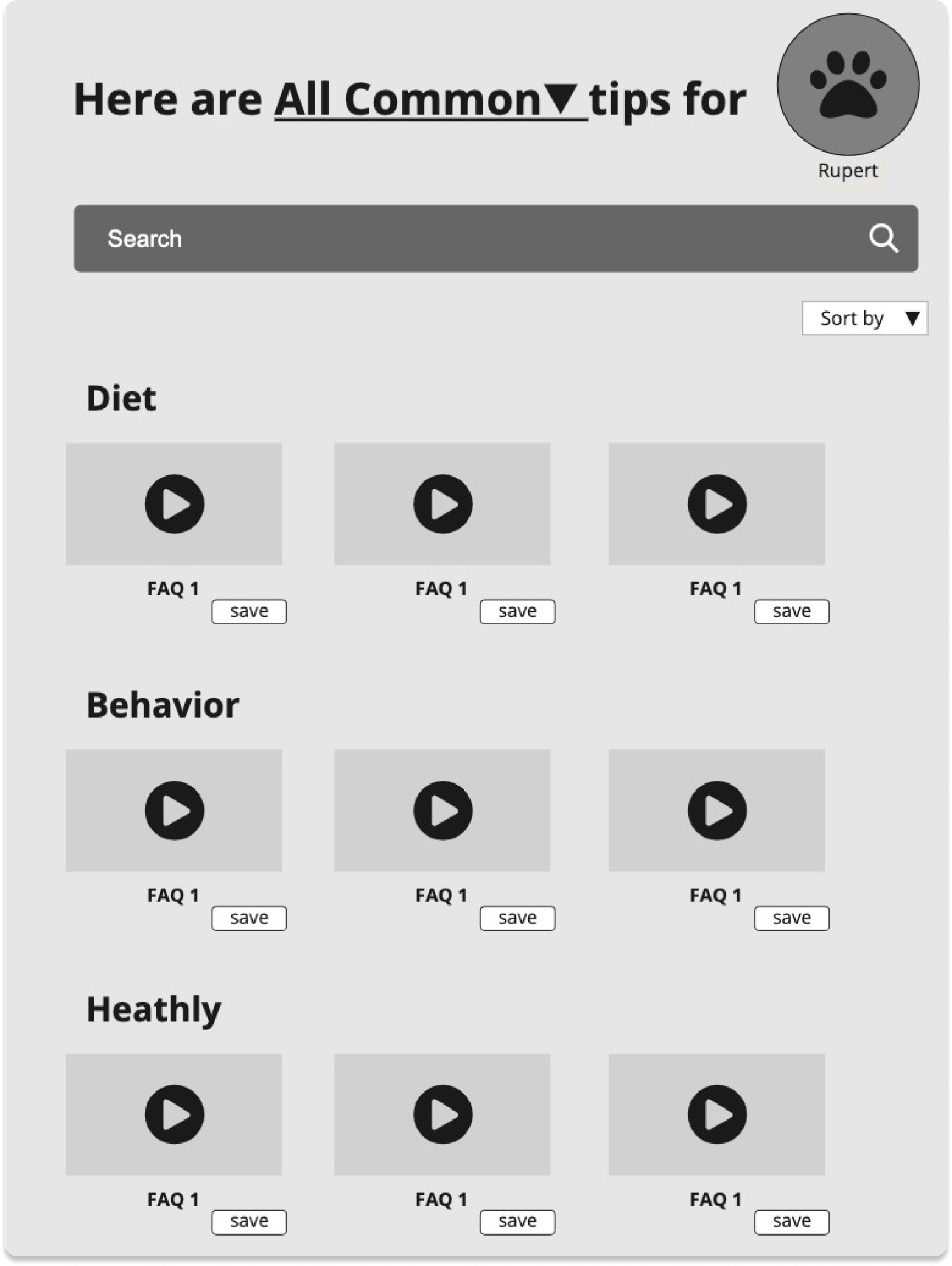
FAQs
Recommended topics in video format for more engaging content
-
![]()
Details
Video and concise, scannable text content


Reorganize IA
We renamed and consolidated the four categories: Diet, Routine, Behavior, Health, to Nutrition, Behavior, Wellness because users found ambiguity in what “Routine” would encompass.


Utilize Gesture
We replaced the slider with a swipe gesture for changing different milestone periods because users felt the slider took up unnecessary space that could have shown them more information.
From Video To Text
We replaced the video gallery on the advice page with text title and image because the video gallery format made users feel less in control.

Adjust Visual Hierarchy
We moved bulleted summary above the video so that users could preview the content before committing to watch videos.
We tested before moving forward.
Overall, users were positive about the functionality of the app. They said it was “helpful”, “comprehensive” and “easy to maneuver”. We applied the usability findings to our high-fidelity design.

4/5 users didn’t change or notice the secondary navigation
→ Labeled tabs to increase visibility and help users maintain a sense of what category they are in while navigating the app

2/5 users clicked on the screen randomly before they swiped
1/5 user swiped outside of the interactive area
→ Slider visually signified a range of explorable options
Improving UI
-
![]()
Progress bar for pet profile setup
Differentiate primary and secondary buttons
-
![]()
Label signifier for milestone slider
Remove tabs and expand space for scrollable content


Did it work?
75% of the users gave a perfect score 5/5.
“If I spend 10 minutes using this app, I already know everything I need to know about my pet instead of having to try to find out.”
Looking ahead ...
The next step would be incorporating a community aspect to the app. Although professional advice is important, sometimes people can learn a lot from other pet owners who share similar experience. Users can not only feel connected but also get faster answers to their unique questions if the app offers two-way communication.
and looking back.
During our user interviews, we uncovered a wide range of concerns associated with owning pets, from pet supply choice to pet safety at home. It was challenging to prioritize which areas we could solve with a digital product in a 2.5 week period.
Once we decided to focus on facilitating users’ research phase, we encountered another roadblock: we lacked the expertise in animal care to write all contents.
We assumed that Petcha would have in-house content writing from animal specialists, but for this project, we consulted a vet as well as conducted secondary research to generate content for placement only, pulling from the following sources.
American Kennel Club
ASPCA
Petfinder
The Spruce Pets
Vet Street
Yorkies United
Pup Box
The Dog Tale