RentCity
Design neighborhood level search page to improve information architecture (IA)
Three other UX designers and I worked collaboratively on this project. My main responsibilities lied in research, ideation, responsive design, testing and prototyping.
2.5 Weeks ( March - April 2021 ) | Client Project
About RentCity
Data-driven and authentic tenant voice
RentCity sets out their mission to facilitate apartment search for renters with unbiased data and first-hand tenant reviews. The unique value proposition is its "RentCity Score" that aggregates data points for safety, walkability and building code violations with emphasis on user ratings for over 650,000 buildings across NYC.
The Problem
Currently, RentCity users will be directed to a page with properties only with no other information when they search for a neighborhood. This page provides limited value for users who just want to explore apartments without specific addresses in mind.

Quantitative User Data
We started our user research with a screener survey to collect quantitative data and filter our targeted interviewees: New Yorkers who have looked for an apartment in the city within 3 years.
The top qualities people look for in a neighborhood
-

Restaurants
-

Safety
-

Rent
-

Transportation
What do NYC Renters look for?
We interviewed four users from age 24-40.
3/4 people have lived in NYC for more than 15 years.
They want to know if they can afford the average rent cost for a neighborhood before they spend time looking for apartments
They value proximity to subway lines because they want reliable transportation for both professional and personal travels
They look for up-to-date crime alerts despite having general awareness of a neighborhood's safety because they know that it varies depending on the street
They want a balance between convenience and personal space. They want business close by for their basic, entertainment and social needs but concern about the noise coming from it
They are interested in the look, feel, and characteristics of a neighborhood that can't be researched from data points
Meet Renting Rachel
Rachel represents the collective findings of our user data.
Pain Points
Struggled to find trusted information to understand the nuances of a place prior to moving
Difficult to gauge safety within a neighborhood
Being rushed to commit to an apartment because of competitive rental market
Doesn’t have enough choices within her budget to live in her ideal location

“I can’t get to the heart of a neighborhood by statistics.”
Highlight Local Voices
We were surprised to learn that many New Yorkers already had assumptions and knowledge about most neighborhoods in the city. Because statistics wouldn't be their decision factor for moving to an area, we deliberated on how might we make the unspoken to be spoken. We not only incorporated practical information such as average rent and transportation in a neighborhood but also reviews from the local community.
-
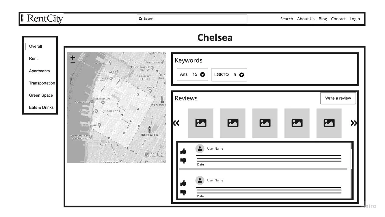
![]()
Overview
Map, keywords, user-generated images and reviews
-
![]()
Review Neighborhood
Real, unfiltered opinions from locals
-
![]()
Average Rent
Quick glance to help considering areas within budget
-
![]()
Transportation
Important factor during apartment hunt based on research data
-
![]()
Nearby Restaurants
Local’s recommendation to create a sense of community


Find the balance between user needs and business goals.
We brought in the founder of RentCity into our design studio. He appreciated our emphasis on community conversations but challenged us to prioritize the real estate aspect of his website for two main reasons.
One of the business models is to monetize site traffic by partnering with brokers
Immediate implementation: the objective is to make the neighborhood level search go live as soon as possible with existing resources. Collecting additional user reviews for neighborhoods, restaurants and parks will cost time and labor that are already scarce in a startup
-
![]()
Top Rated Buildings
Utilize user reviews to promote properties without losing authenticity
-
![]()
Explore Buildings
Buildings within a neighborhood. Sort by “most reviewed”, “rating” or “most recent”
-
![]()
Similar Neighborhoods
Encourage users to explore other areas, increasing exposure of more properties
-
![]()
Local Recommendations
Consolidate different kinds of reviews to reduce emphasis yet preserve a sense of connection


Feedback from user and stakeholder
We tested 4 users on our mid-fidelity prototype. All users were satisfied with the content about a neighborhood and the simplicity of our design. We applied the usability findings combined with RentCity founder's feedback from a business point of view to our high-fidelity design.
Increase Clarity & Reduce Noise
-
01.
Improve visual layout: change the orientation of the anchor link menu from vertical to horizontal and make the map bigger and clearer
-
02.
1/4 user interacted with the toggles which let users customize map view. It showed that this functionality was irrelevant to them
→ Simplify map feature by removing toggles
-
03.
3/4 users thought the numbers represented how many places were in the neighborhood. They didn’t expect to engage with an information based website the way they would with a social media platform
→ Reduce interaction by boxing in the keywords in place of the like button
-
04.
All users liked the ability to gauge the quality of a neighborhood with a score, but none of them understood how it was calculate
→ Add a tooltip for clarification and increase the validity of RentCity Score
Overlap Between User & Business
-
01.
Reorganize hierarchy: move the reviews above building information to highlight user reviews
-
02.
Personal tone of voice: change the header to a warmer tone to help users feel connected with the community
-
03.
Monetize: keeping business opportunities in mind, place the top rated buildings on the map as a potential advertisement medium


Responsive Design
Content Prioritization And Orientation
We displayed "local favorites" and "similar neighborhood" cards in landscape orientation because the information on each card was short enough to adapt to the horizontal layout. We stacked them vertically instead of horizontal scroll as the number of cards was only a few.
We reduced the preview text of the restaurant reviews from 3 lines to 1 line because they were supplemental to prompting community conversations.
Similar neighborhoods' number of keywords reduced to half because they were least likely to influence a moving decision.
On the contrary to the reviews of "local favorites", the user reviews of the apartment buildings were the core value of RentCity. We maintained the same content presentation and kept all 3 lines of the preview text for the building cards.
We differentiated “highlighted buildings” and “other properties” using horizontal and vertical scrolling directions respectively.
Scale Down Map
To adapt the design into one column layout and much more limited viewport on mobile, we replaced the fixed, large size map with a small map that scrolled with content. Users could expand the map into a full screen view and manipulate it based on their needs.
Did it work?
Our design categorized 650,000+ RentCity buildings across NYC, originally more than 65,000 pages (10 results per page), into less than 330 neighborhood level pages. We utilized related content for users to easily navigate to and explore different neighborhoods, increasing exposure of more apartment buildings in context.
Not only did we successfully restructure the information architecture, this new feature provided value even for New Yorkers who were already familiar with the city. 8 users said that “they learned more about the neighborhoods”. They found both desktop and mobile versions “clear” and “useful”.
What’s next?
Link to apartment listings
During our two rounds of usability testing, majority of the users expected to see available rental units. The next step is to understand whether providing rental listings, either internally or externally, aligns with the company's business strategies before we incorporate the listing feature.
Design system
As a startup, RentCity has limited resources and lacks in-house design and development teams. It was challenging for us to achieve cohesiveness in our design without a pattern library. We inspected RentCity’s live website and found inconsistency in its UI design. Our goal is to implement a design system for consistency in new feature developments as the company evolves.